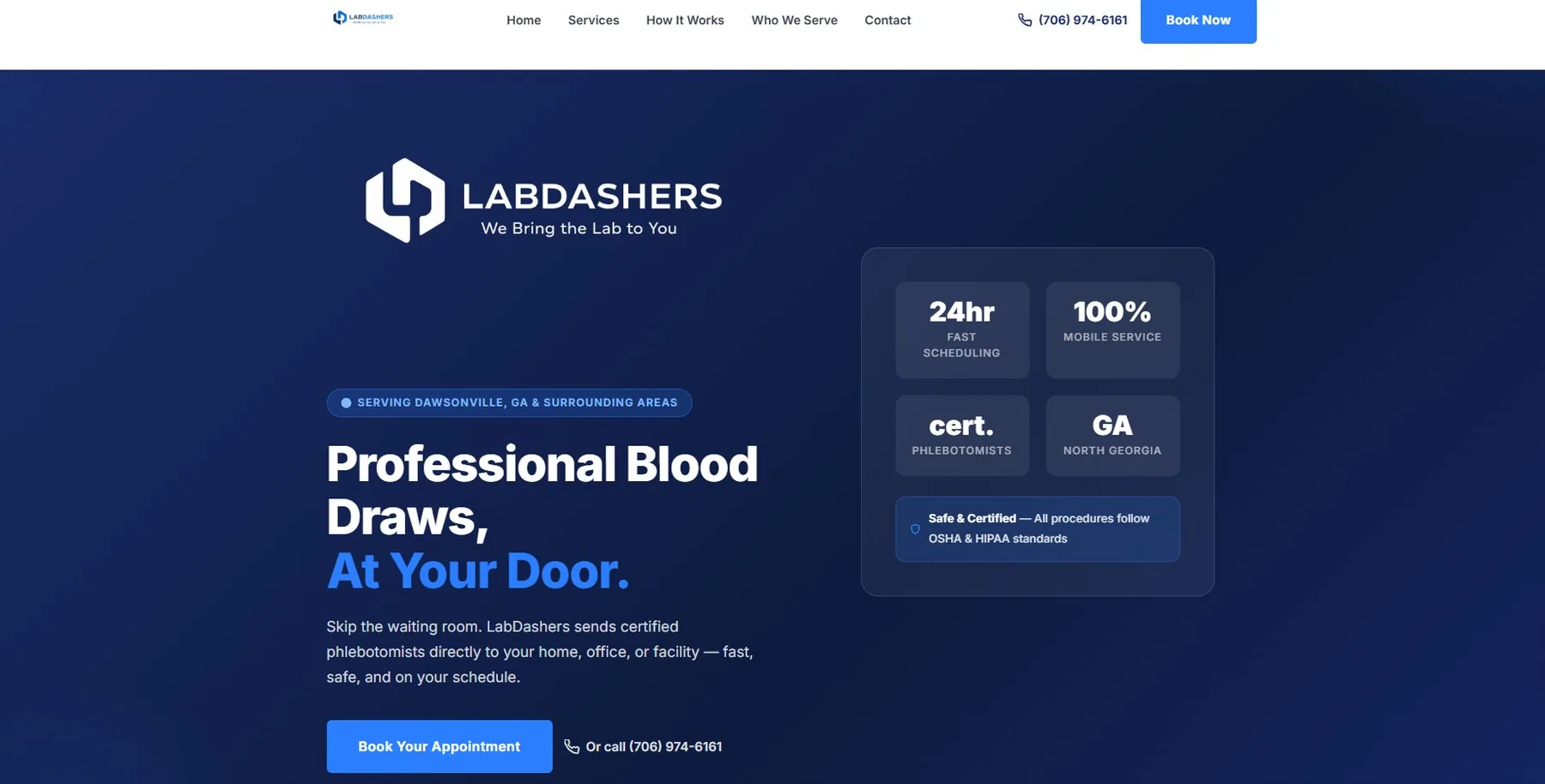
01 / The challenge
What needed to move.
LabDashers was starting from the ground up. The service was useful, but mobile phlebotomy is not something every patient immediately understands. The brand had to feel credible enough for healthcare while still feeling simple and personal enough for someone booking a blood draw at home.
The job was to create the identity, explain the service clearly, build trust quickly, and remove as much friction as possible between finding LabDashers and requesting an appointment.
02 / The thinking
Make the next step obvious.
We centered the experience around one simple idea: LabDashers brings the lab to you. From there, every decision had to answer the questions a patient or caregiver would naturally have. What is this? Who is it for? Can I trust it? How does it work? What do I do next?
The audience included older adults, caregivers, busy professionals, and people who simply needed a more convenient option. That meant readable design, plain language, clear calls to action, and a booking path that did not make people work to understand it.
04 / The build
Strategy into something useful.
Northbound created the LabDashers logo and visual identity, shaped the positioning and messaging, designed and built the responsive website, structured the service and location content, and created the booking experience around the way the business actually operates.
The work also extended behind the website. Appointment forms, patient acknowledgments, confirmation flows, reminder workflows, calendar connections, analytics, local search foundations, and supporting digital systems were designed to make the business easier to run as real appointments started coming in.
Logo designBrand identityPositioning and messagingUX strategyWeb designWeb developmentBooking workflowAppointment remindersAnalyticsLocal search foundationDigital systems